
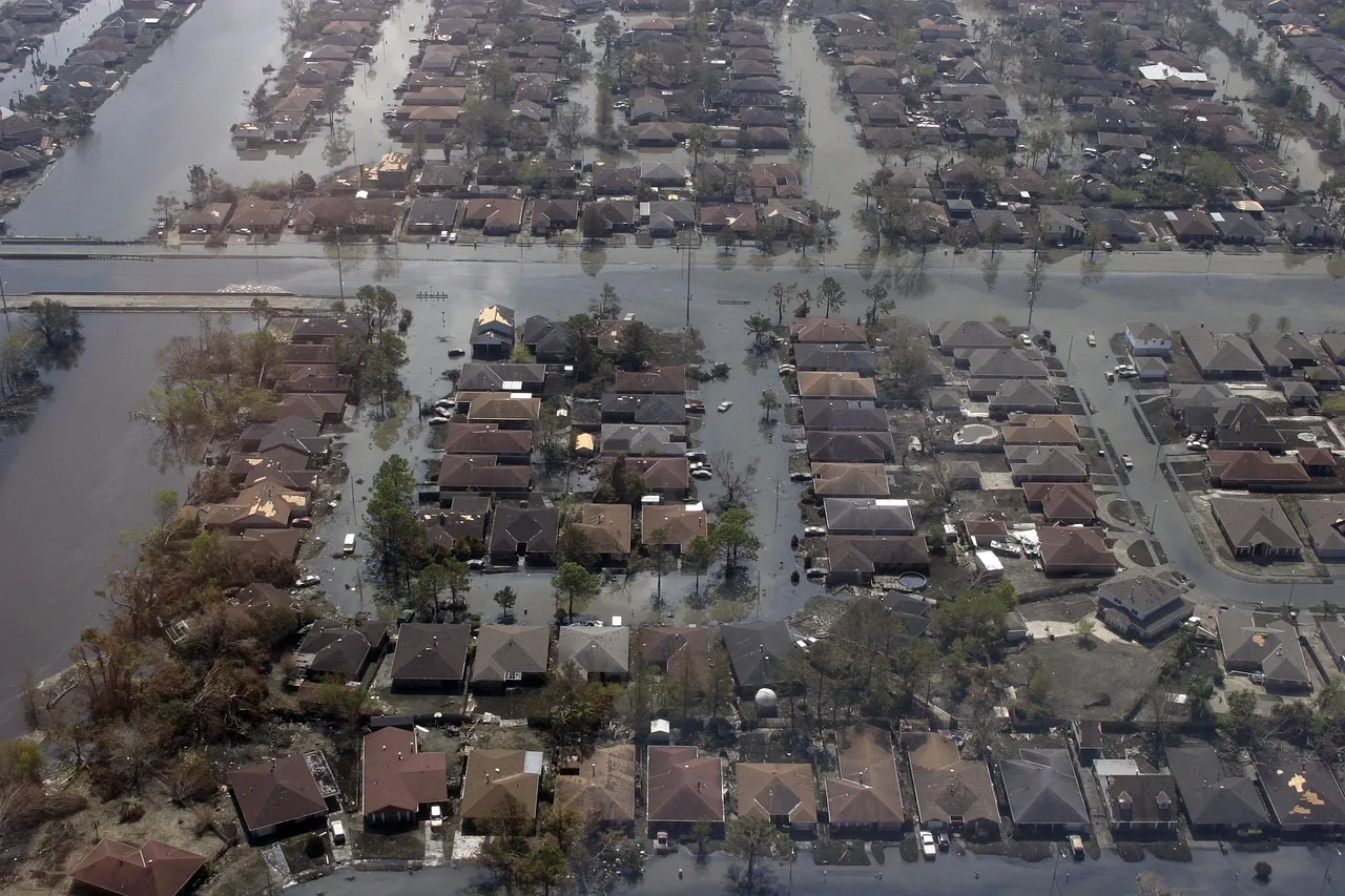
Flood maps look authoritative. Blue lines, tan shading, neat percentages tied to “100-year” or “500-year” events. They give the impression that risk has been measured and settled, that anyone outside the shaded zone can breathe easy.
The reality on the ground is messier. Across the country, entire regions that read as safe on federal maps have flooded hard in recent years, sometimes fatally. The gap between the paper and the pavement has become one of the more consequential blind spots in American disaster planning, and a handful of places illustrate it especially well.
1. The Texas Hill Country around Kerr County
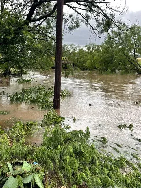
When flash floods tore through Kerr County, Texas in July 2025, they hit neighborhoods that sat outside FEMA’s mapped high-risk zones almost entirely. The 2025 flash floods in Kerr County, Texas, devastated neighborhoods far outside FEMA-mapped zones, where only 2.2% of residents had flood insurance. The Guadalupe River did not rise gradually. It surged.
Even inside mapped areas, the numbers understated what actually happened. A federal flood map of Kerrville, Texas, with the Guadalupe River winding through the middle, shows areas considered to have a 1% annual chance of flooding in blue, yet during the July 4, 2025 flash flood, the river rose more than 30 feet. A map built on historic averages had little chance of anticipating a rise like that.
2. Buncombe County and the Asheville area in western North Carolina
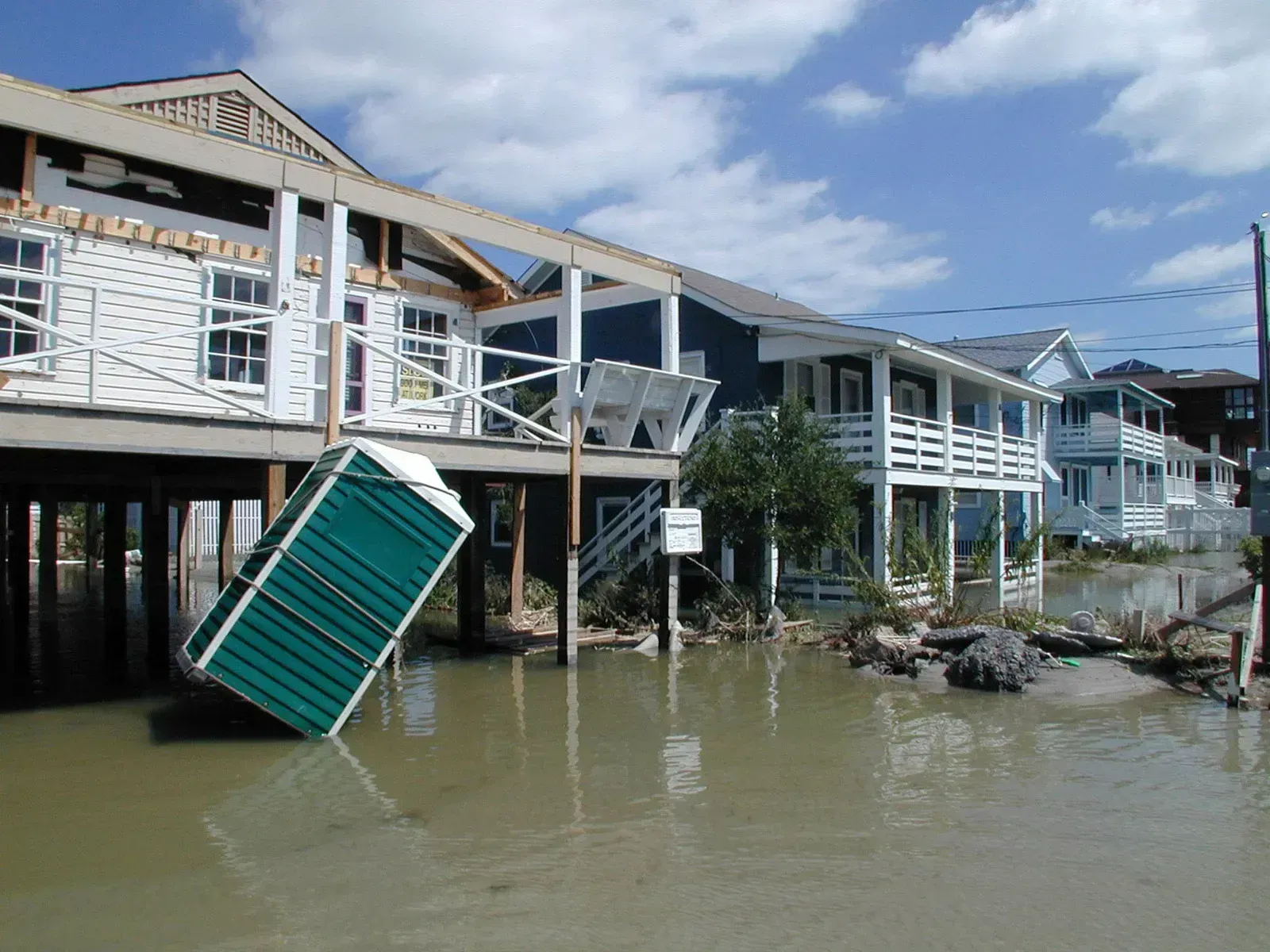
Appalachia has long been treated as a low flood priority on federal maps, largely because the models emphasize riverine and coastal flooding over mountain rainfall. The Flood Insurance Rate Maps used by FEMA are based on antiquated data and obsolete models, and as a result, the U.S. government downplays flood risks for homeowners across the country, especially in mountainous regions like Appalachia. That gap became impossible to ignore in September 2024.
Hurricane Helene delivered rainfall that overwhelmed the region’s terrain and its expectations. When Hurricane Helene hit in September 2024, Asheville received rainfall that exceeded what a 1-in-1,000-year event would be expected to produce, and Buncombe County had a flood insurance protection gap of 88 percent. In Buncombe County, where an entire town disappeared beneath floodwaters, less than 1 percent of households had flood insurance. Almost nobody there had been told to expect this.
3. South Brooklyn and other coastal New York City neighborhoods
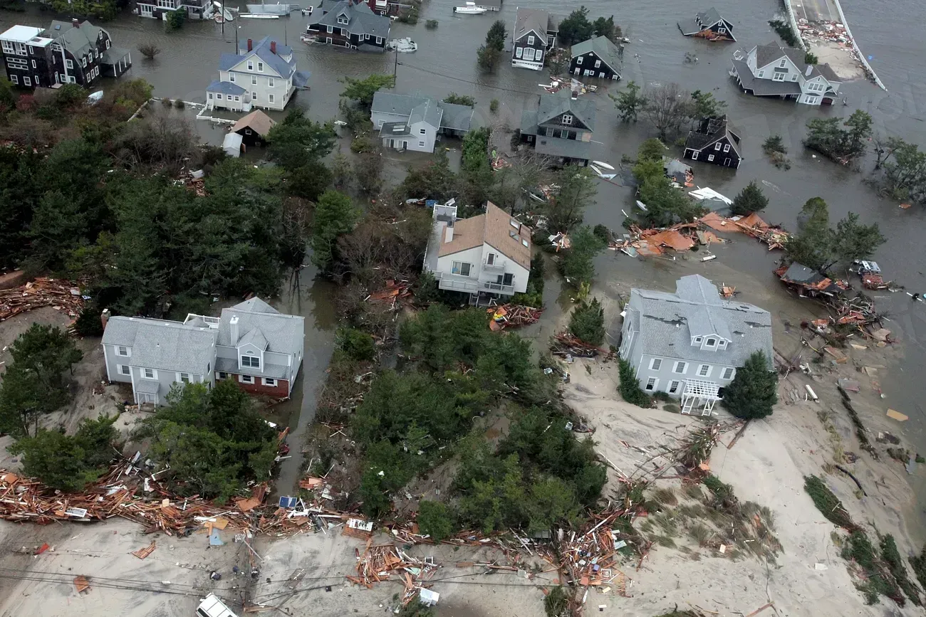
Before 2012, large swaths of South Brooklyn were not considered high-risk by federal standards. That assumption fell apart during Hurricane Sandy. The process by which FEMA and the community must agree played out publicly after 2012’s Hurricane Sandy extensively flooded South Brooklyn, New York, an area not previously considered high risk.
Coastal cities face a particular mapping challenge because flood models often lag behind both sea-level rise and the pace of intense storm activity. Updating designations for dense, developed neighborhoods is politically fraught, since new high-risk status triggers insurance mandates and stricter building rules for thousands of homeowners at once. That friction slows the kind of correction that events like Sandy make painfully obvious.
4. Basement and below-grade apartments in dense Northeastern cities
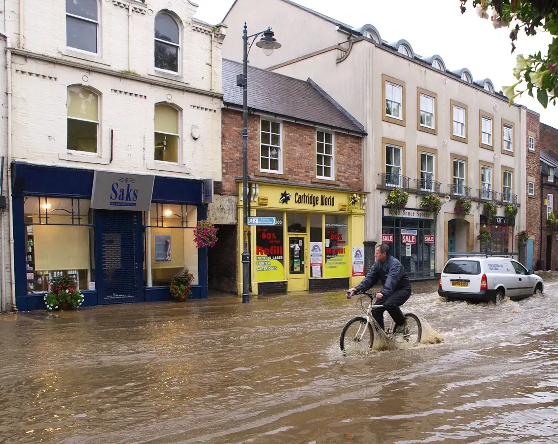
Flood maps are built around rivers, coastlines, and floodplains. They are far less equipped to capture what happens when rainfall itself, not an overflowing waterway, overwhelms a city’s drainage system. Urban flooding refers specifically to flooding that occurs when rainfall, not an overflowing body of water, overwhelms the stormwater drainage capacity of a densely populated area.
New York City learned this in the starkest way possible during Hurricane Ida in 2021. Hurricane Ida, strengthened by warm air, shattered records across the Northeast, and in New York City the deluge made rivers of impermeable streets and subway stations; eleven people living in basement-level apartments drowned as the floodwaters, with nowhere else to go, swiftly overwhelmed below-ground spaces. None of those basement units needed to sit inside a FEMA-designated flood zone to become death traps. The water simply had nowhere else to go.
5. Fast-growing inland and Sun Belt suburbs
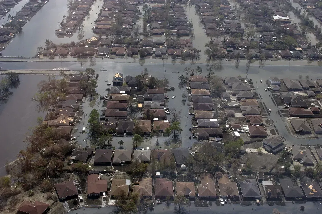
As development pushes into new inland territory, flood exposure is expanding faster than the maps meant to track it. Research groups analyzing this gap have found some startling regional disparities. Some inland and fast-growing regions have 5 to 8 times more high-risk properties than FEMA identifies, yet show among the lowest levels of flood insurance adoption.
Part of the problem is structural. The average time to develop and finalize a new FEMA flood map is seven years, meaning many maps are outdated by the time they are released. A subdivision built on a floodplain today may not show up as risky on paper until well into the next decade, by which point thousands of new homes have already been sold under a false sense of security.
6. Communities sitting behind levees, dams, and floodwalls
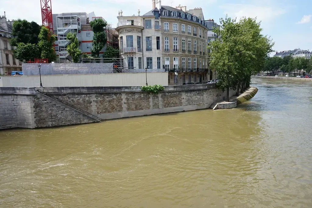
Structural flood defenses create a strange paradox in mapping. They can lower a neighborhood’s official risk category even though the underlying danger, a levee breach or dam failure, never fully disappears. Areas protected by levees, dams, or floodwalls can still fail, yet the residual risk from these defenses is generally not identified by FEMA maps, even though federal law requires them to be.
This means residents behind aging infrastructure often carry a false sense of security precisely because of the protection meant to reassure them. The map shows a shielded zone. The engineering behind that shield, in many cases decades old, tells a more uncertain story. It is one of the clearest examples of how a binary “in or out” system flattens what is actually a sliding scale of risk.
Taken together, these six places show a consistent pattern rather than isolated bad luck. Flood maps are built on historical data, political negotiation, and models that struggle to keep pace with heavier rainfall and faster urbanization. During Tropical Storm Debby in August 2024, 78% of the flooded properties, representing $10 billion in damages, were outside FEMA’s designated high-risk areas, underscoring how binary maps can mask real exposure. For homeowners and renters alike, that statistic is a reminder that a map’s blue line is a starting point for understanding risk, not the final word on it.

- The “Solar Effect”: 5 Unlikely Cities Remade by Renewable Energy Investment - September 18, 2026
- 6 Places That Appear Low-Risk on Flood Maps – But Tell a Different Story on the Ground - September 18, 2026
- The 10 Countries Investing the Most in Space Exploration - September 17, 2026
