

- The Planet Where It Rains Liquid Glass – 7 Alien Worlds Defying Known Physics - November 14, 2026
- Stars Consuming Entire Worlds – 6 Planetary Systems Swallowing Their Own Worlds - November 14, 2026
- The Ground Liquefies Like Water – 6 Silent Fault Lines Geologists Watch Closely - November 14, 2026
Every summer, tens of millions of Americans glance at a weather app, see the words “heat advisory,” and shrug it off as a minor inconvenience, something for people who wilt easily. Meanwhile, the phrase “excessive heat warning” gets the eye-roll of genuine concern. It turns out that hierarchy of alarm is backwards more often than most people realize, and the confusion has real consequences for public health.
The heat index itself, that combination of temperature and humidity that tells you how hot it actually feels, sits at the center of a surprisingly messy warning system. Thresholds shift by region, terminology has changed in recent years, and the category that sounds least urgent, the advisory, is frequently the one tied to the most preventable deaths. This piece breaks down where the confusion comes from and why the “lesser” warning deserves far more respect than it usually gets.
What the Heat Index Actually Measures
The Heat Index is a measure of how hot it really feels when relative humidity is factored in with the actual air temperature. It reflects the apparent temperature, what the air actually feels like on human skin when relative humidity is taken into account, because when humidity is high, sweat doesn’t evaporate as efficiently, which slows the body’s ability to cool itself and raises the risk of heat-related illness. That distinction matters enormously, since a muggy 95 degrees can be more punishing on the body than a dry 100.
The math behind it isn’t something the National Weather Service dreamed up overnight either. The heat index was based on the work of Robert G. Steadman, a textiles and materials professor at Colorado State University, who published his temperature–humidity index table in 1979, though his original equations required variables that weren’t readily accessible from standard meteorological data. The version used today is a simplified approximation built for practical forecasting, not a laboratory-grade physiological model, which is part of why local offices interpret it with so much local nuance.
A Patchwork of Local Thresholds
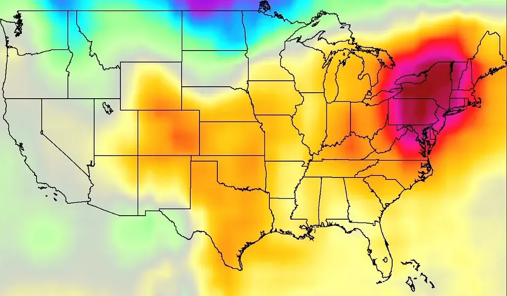
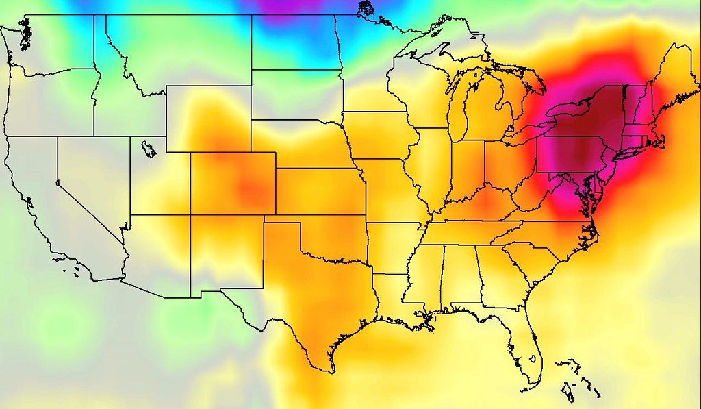
Here’s where the confusion really starts. There is no single national temperature that automatically triggers a heat advisory or warning. There is no single national temperature that triggers these alerts because the thresholds are local, since the same temperature is far more dangerous in a place that isn’t used to it. A heat index that barely raises an eyebrow in Phoenix could shut down an entire city in the Pacific Northwest.
The regional variation is dramatic. Areas along the Gulf Coast and parts of Texas and Oklahoma have the highest criteria to warrant a Heat Advisory, while portions of the Texas and Oklahoma panhandles westward into New Mexico have the lowest thresholds, especially over the higher elevations. Meanwhile in places like coastal Maryland and Virginia, a Heat Advisory is issued when heat indices reach 105 or higher east of the Blue Ridge, and 100 degrees or higher west of the Blue Ridge. Someone who moves from Tampa to Portland, Maine, and assumes the numbers mean the same thing everywhere is setting themselves up for a dangerous miscalculation.
Advisory Versus Warning: The Real Difference

Many people assume a heat advisory is just a watered-down warning, a bureaucratic courtesy notice. That’s not quite right. A heat advisory is the lowest level heat alert, issued when dangerous heat is happening, but the heat is not quite to the level of an excessive heat warning. It is still a signal that conditions are genuinely hazardous, not simply uncomfortable.
The jump to the higher tier reflects a measurable escalation in danger, not just a stylistic change in wording. The jump from advisory to warning isn’t bureaucratic, it reflects a real rise in risk, and under a warning heat illness can develop fast even in healthy adults, and it’s deadly for older people, young children, outdoor workers, and anyone without air conditioning. In parts of the eastern United States, an Extreme Heat Warning is issued when an extreme heat event is expected in the next 24 to 36 hours, defined in that region as a heat index of 110 or greater east of the Blue Ridge and 105 or greater west of it, used for high heat conditions that pose a significant threat to life.
Why Overnight Lows Are the Hidden Variable

Most people fixate on the daytime high when they think about heat danger, yet meteorologists increasingly point to nighttime temperatures as the real killer. When the low stays above about 80 degrees Fahrenheit, the body cannot shed its accumulated heat, which is why consecutive hot nights drive most heat-wave deaths. A single scorching afternoon followed by a cool evening is far less dangerous than a milder heat wave that never lets the body recover overnight.
Some forecast offices have already built this into their criteria rather than relying on daytime peaks alone. An Excessive Heat Warning in one region means Heat Index values are expected to reach or exceed 110°F and not fall below 75°F for at least a 48 hour period, with a warning also possible for extended periods of afternoon heat index values between 105 and 110 degrees. That “not fall below” clause is easy to miss on a quick glance at a phone alert, but it’s often the detail that separates a rough week from a genuine emergency.
The Historical Wake-Up Call: Chicago 1995

If there’s one event that reshaped how seriously agencies take advisory-level heat, it’s the Chicago heat wave of 1995. The 1995 Chicago heat wave is one of the deadliest heat events in U.S. history, yet the National Weather Service didn’t issue a single heat watch in the days before the event, instead issuing its first heat advisory the day the heat wave struck. Hundreds of people died, many of them elderly residents living alone without air conditioning.
The aftermath forced a hard look at how conservative the old thresholds had been. When local officials found hundreds were killed, they concluded that the weather service temperature thresholds for local extreme heat warnings were too high and were likely costing lives, and the officials persuaded NWS to issue heat watches and warnings in Chicago at lower temperatures. Officials have identified similar problems with NWS in places such as South Florida, which is part of why thresholds keep getting adjusted even decades later.
The New “HeatRisk” System and What It’s Meant to Fix

In recent years, forecasters have leaned on a color-coded companion tool called HeatRisk to give the public a more intuitive sense of danger than raw index numbers alone. NWS HeatRisk is supplementary to official NWS heat watches, warnings, and advisories, providing guidance for decision makers and those who are sensitive to heat. It’s designed to translate a jumble of numbers into a simple risk category that doesn’t require memorizing local thresholds.
The tool appears to be working where it’s been closely studied. Based on an analysis of emergency room visits across Maricopa County during 2020 and subsequent years, it has been found that HeatRisk categories accurately describe the level of heat-related illness, with spikes in ER visits noted during “Major (High)” and “Extreme (Very High)” HeatRisk categories. Yet even this improved system comes with a caveat that reinforces the whole theme of this article: heat-related illness was observed even on “Low” days, clearly indicating that even without official alerts heat can pose a significant health threat if precautions are not taken.
Terminology Changes Are Adding to the Confusion
Just as people start to get comfortable with a set of terms, the National Weather Service changes them. The National Weather Service renamed Excessive Heat Warning to Extreme Heat Warning in March 2025, but older articles, cached pages, and habit still keep the old phrase alive, even though Extreme Heat Warning is now the official term. That kind of mid-stream rebranding, however well-intentioned, tends to muddy public understanding rather than clarify it, at least in the short term.
Research into how the public actually interprets these terms backs this up. A study examining public comprehension of NWS heat products found that heat index, humidity, real feel, or feels like temperatures were seldom mentioned or absent in participants’ responses, showing that people may be unaware of one of the primary impacts that necessitated the NWS issuing a particular product, and that people will not automatically assume a watch, warning, or advisory involves humidity or know what conditions will feel like. In other words, the very variable that makes heat dangerous, humidity, is often invisible to the people the alerts are trying to protect.
Why Public Perception Lags Behind the Actual Risk

Even setting aside the confusing terminology, there’s a broader psychological gap between how dangerous heat actually is and how seriously Americans take it. Across the U.S., only about 35% of Americans say they are moderately or very worried about extreme heat, according to a recent study by the Yale Program on Climate Change Communication. That’s a strikingly low number given how the toll has grown.
The mortality trend line makes the disconnect even more stark. Heat-related deaths in the U.S. have surged more than 50% since 2000 as the climate warms and temperatures rise to record-breaking levels. Researchers have also found that official death tolls likely understate the true burden significantly, since official heat-related death counts are routinely underestimated, and according to one researcher it’s “not only an underestimation – it’s a gross underestimation.”
What This Means for How You Should Read a Heat Alert

The practical takeaway is simple, even if the underlying system is anything but. Treat a heat advisory as a genuine warning sign rather than background noise, especially if you’re older, work outdoors, or don’t have reliable air conditioning. Treat published thresholds as operational cues, not trivia, because if tomorrow’s heat index reaches the low 100s but the local office has issued only a heat advisory, the body stress is still real.
It also helps to remember that these alerts are locally calibrated for a reason, not arbitrarily inconsistent. Heat alert thresholds do vary a bit from place to place, as people living in cooler climates will have impacts from heat at lower temperatures than someone who lives in a hotter climate and is more accustomed to the heat. A number that sounds unimpressive on a national scale might be exactly the threshold your specific region has learned, sometimes the hard way, actually matters.
Closing Thoughts

The heat index warning system was built with good intentions and real science, but it was never designed to be intuitive to someone scrolling past a phone notification. The gap between “advisory” sounding minor and “warning” sounding severe doesn’t match the actual risk curve nearly as closely as most people assume, and that mismatch has cost lives in the past.
The next time an alert pops up on your phone, it’s worth pausing for a moment longer than usual. That modest-sounding advisory might be doing more to protect your health than its name lets on, and understanding the numbers behind it, not just the label, could make all the difference on a dangerously hot day.
